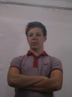
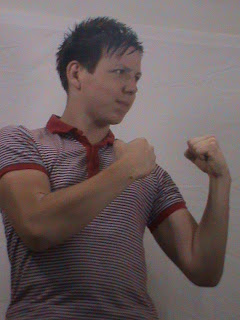
recently we got some new lighting equipment in to help us when we start directing our music video for our coursework to try and get the right type of lighting we would need for certain moods/environments, to this out we dicided to do a photoshoot to also have a go at photogrphy, the cameras we used for this weren't really photo cameras but rather video cameras on a photo setting.
after the shoot i chose the three pictures that i thought were the best and done a little bit of editing to them, these pictures can be seen below.
A Blog To End All Blogs
Thursday 21 July 2011
Wednesday 20 July 2011
Lip Sync Task
please not that neither me nor david own the rights to music used in this video.
we went through many different songs first before deciding upon this one. originally we wanted to do a song called death to all but metal by steel panther but due to the offensive lyrics of the song we decided against it and chose one from a band we both like.
Tenacious D's song tribute is based after their film Tenacious D and the pick of destiny where they defeat the devil by coming up with the best song in the world but they then forget it afterwards and thus tribute was written as a tribute to the greatest song in the world.
first of all we decided upon a location that was close to us and allowed for a quick access which we found quite quickly. then as there were two of us and we felt like we needed more people we hired one of our friends to help us out with it.
i feel like what we did well was the fact that we pretty much got the lip sync part spot on, theres only really one part where it goes off a little bit. next time i think we should manage to try get the filming of it doen quicker as in the time we did it we didn't ahve thatn long for editing and also francis wasn't available to film for some part of it so we had to substitute him.
Thursday 16 June 2011
the history of music video
this presentation has been done by me and david on the history of music videos, their progression and key milestones of the industry.
01 the history of music videos
View more presentations from phil sweeney
Wednesday 6 April 2011
explosion of uploads
now here is a long set of uploads to finish off our project in it's entire form. Example shot - editing previously i loaded up a shot on this blog which showed a clip that i myself directed and what i thought it was. now here is a shot that i have personally edited.
this is the shot in it's final edited form. the main thing that i had to work with here was the lighting editing, because this shot was film when it was particularly sunny and we aimed the film to be around twilight/night time. because of this i had to turn down the lighting effects like in many of the other shots, one of the main concerns was the shaft of light coming from the archway on the right hand side. this part required additional lighting effects, i feel that i did this very well and managed to turn it from sunlight into a sort of moonlight effect which works fairly well in my opinion. Test Screening: this test scrrening was for our rough version of the film before the final editing stage, with it we decided to provide refreshments for our audience. https://spreadsheets.google.com/ccc?key=0AoczCgCcjdEfdE9IcXVRUFExVHIxZkk0WTVCMlpneUE&hl=en#gid=0 these questions are in order for how the results are set out on the spread sheet. age + gender: our audience for this test screening were mostly 16 - 17 year olds with the exception of our teacher who was also there (i won't divulge her age). this fitted in with our target audience type of between 15-25 year olds as the averages fitted in between it. the gender side however we had slightly more females than we did males, this isn't the best thing in the world as our primary target audience were males while our secondary were female. do you like watching films?: this section of the questionnaire was merly a formality, luckily 100% of the audience said they liked watchiing films. what is your favourite genre of films?: this section was to determin what type of films they already enjoyed. luckily for us around half of the audience were already fans of the thriller/horror genre which was a hybrid of the two genres we were aiming at, if that hasn't become apparent. what was your first impressions of our film?: approximatly 80% of the audience gave our film either a good or very good rating, none of our audience gave the film a bad rating. Would you go to see is film in the cinema?in the feedback it shows that over half of our audience would go to see the film int he cinima, this would leave just under half saying they wouldn't. at first this would seem like a bad thing, but it has to be taken into account that this is only a rough ersion of the final product. Is the plot clear so far? seeing as this is only the opening 2 minutes of the film it can be considered understandable why around a third of the audience didn't actually understand the plot. Do you think the setting was appropriate? around a quater of our audience thought that the setting we used wasn't sinister enough, in the planning and developing stage we thopugh we would rather go for a settign in which people ould be more familiar with than actually think was sinister. What did you think of the music used?all of our audience thought that the music in the film was of good effect, only one comment was made about the diegetic sound and that was the first thing we fixed. Does the editing make it flow? this area of the feedback we got the most information in which to change about it from. this section pointed out many areas which we had to tweak to amke wotk properly. What age group do you think this film is aimed at? this question was added in after we made all the other questions, it was mainly to see whether our audience thought that the film was aimed at them or not. luckily the auidence thought that it was aimed a slightly younger age. due to the fact that this is 2 minutes of the opening more adult themes would have been added later. final cut: this is the end result of all our hard worka nd the long hours put into it. hope you enjoy =D http://www.youtube.com/watch?v=5WGboXo3XnY&feature=channel_video_title like all film projects we did an evaluation of it, to be different we decided to do it as a video interview style. evaluation: http://www.youtube.com/watch?v=gU5lt2IlN-A&feature=channel_video_title These links are to the video clips, this is because the uploaders are not working properly. i think technology is getting it's payback for what i said in the evaluation.
Sunday 13 March 2011
production - directed shot
this is a shot that i directed myself, admittedly it is not my favorite shot but it is one of them. this version is an uncut version so there is some diegetic sound which will not be in there once the shots have been edited. i feel that this shot captures the haste and rush that we attempted to create in the film but also create a sense of ambiguity as the viewer doesn't know where abouts they are. once this shot has been edited and cut down a bit i feel like it will play an important part in setting the mood of the film in general.
Monday 28 February 2011
audience feedback analysis and initial stages of production
for lucid we had two main tyoes of audiences in mind.
males aged 15-25 as our primary audience with femals of the same age group as out secondary audience type.
because of our current technological generation we would be using these technologies to promote the film to the specific audience types and also influencing the audiences we feel are close to this genre of film by exposure. these technologies could be through websites like facebook or twitter, websites such as imdb for those hardcore film fans and the possibility of apps for android software.
as a sample group we made a presentation to our peers about what our film would be about and the basic ideas of this film would be, we chose to do this with our peers as they are the target audiences in which the film would be aimed at. from the feedback we got from them the only thing we really needed to do was to develop our ideas a bit more (which was fair enough as we didn't have many solid ideas at the point in time).
in the following video there is a pan round shot of our main area for the production as well as a number of still images cleverly put into one neat comfortable package. we chose this area as our main production set becuase it was easily accessable and prodived us with the main areas we had been looking for in the development process.
the follwoign two storyboard clips are ones that represent some of the classic features of our genre of film and are incredibly important to the wider picture of the film.
with the issue of non-diegetic sound is that we know what type of sound we are looking for but we haven't located a sutible enough soundtrack to put in at this point in time.
Tuesday 15 February 2011
the inspiration behind Lucid
now this does say it was done by chloe scotnety. this is due to the fact that she is the one that uploaded it to slideshare as it took me approximatly an hour and a half to do and took her like 10 minutes if that O.o. but i assure you we all contributed to the ideas for this. hope you enjoy what is to come next :)
Subscribe to:
Posts (Atom)